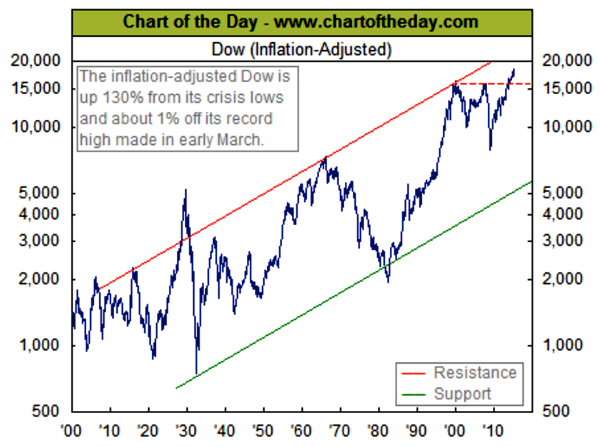
The inflation adjusted Dow or similar “inflation adjusted” measures of performance
remind us that earnings and returns on investment, in the end, are about what you can
buy with your profits. As the cost of living rises inexorably, we all need to generate
greater dollars to maintain and hopefully improve our wealth.
We hear of “record” levels for stocks, from time to time but without adjusting for inflation
this is as deceptive as comparing Elvis Presley’s 1956 earnings to those of Taylor Swift
in 2014. So the chart below is one I like to check from time to time, as it tells us if
markets are truly making progress for investors over longer time spans.
As I noted here last year and at our annual client event, this chart should get a true
“technician” excited. Any asset class whose real level is able to exceed the level that
has held it in check for some 13 years is usually sending a strong continuation signal.

